Fonts play a big role in creating classroom worksheets, activities and many teachers love making their own.
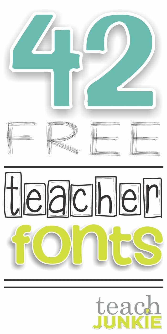
Here are 67 free fonts that were created by teachers and will help make your classroom activities bright, whimsical and add just the right touch.

Let’s break down the free fonts by type so you can find what you’re looking for and I’ll share a tutorial link at the end in case you want to install them and haven’t done so before.
Print/handwriting friendly fonts
These fonts are great for giving directions or using as your main text font.

1. Print Dots – This dotted font is great for handwriting and tracing. Create your own free worksheets using these dotted letters and numbers.

2. Ashley – A handwritten font that is very friendly for teachers and students of all ages. It’s a pretty thick font and features the classic stick and ball formation for letters.

3. Pinwheel – This outline font is friendly for making title and letters that you want students to be able to color in. Features the fancy and has that handwritten look.

4. Doodle Print – I really like the stylish uppercase of this font and the strightness of the vertical lines. It’s a classic font style and very friendly for younger readers.

5. Recess – A thicker version of the doodle print font above and also is more modern in the style. This font’s uppercase is definitely it’s strongest piece and very uniform in size.

6. Starting Dots – This font is designed to help beginning writers know where to start their basic strokes when forming letters. Great for creating handwriting worksheets and tools.

7. Script – This thin tipped font will make a great font for upper grades. The look is classic formation for the alphabet written in cursive. It’s probably best used for practicing separate letters rather then putting them together in words, but beautiful letters separately.

8. Princess Print – This font has thin lettering and thicker numbers. The edges are rounded which gives it a softer feel.

9. What – This thicker font features wide letters and numbers. The lowercase letters start high, giving this a modern handwritten feeling.

10. Basic Apple – This thin-tipped font will make a great font for titles and subtitles. The look is classic and basic.

11. Writing – This medium-tipped font is ideal for primary grades and includes a fancy number one. This one is about as neat as we’d all like to write in front of our classrooms for modeling.

12. Thick Apple – This more personal writing font is very friendly to creating both print and titles for worksheets and projects. The bold tip makes it stand out.

13. Vanilla – This more personal style is light-tipped but models great shaping to letters. The uppercase letters are fantastic!

14. Casual Apple – This thicker casual font has wonderfully rounded tips which makes it appear more teacher friendly.

15. Denealie – This D’Nealian style font has a thin tip and your classic style letters and numbers. Ideal for smaller print.

16. Leslie’s Hand – This thicker-tip font is more closely spaced together for lettering and more widely spaced with the numbers.

17. Love Laughing – This is the thickest tip of all the handwriting/print fonts and models the classic sticks and circles approach to forming letters.
Dotted-tip fonts
These fonts are great for adding a little detail to your titles. It’s a classic teacher look.

18. Dots – With varying sized letters and numbers, this dotted tip font will make for a cute title or subtitle. [no longer available]

19. Cuteness – This straight-lined medium tip font incorporates a D’Nealian style lowercase a.

20. Cherry – This font has tiny-tips and makes for a subtle detail. The light weight makes it harder to read from far away, but it’s easier on the eyes for reading when there is more text than a traditional tip font.

21. Primer Dot – This medium weight font has matching medium tips.

22. Jumbled – This font is a slightly lighter version of the font above. The letters sit on different planes creating a fun, jumbled look.

23. Fontabulous – This thin tipped font has dots wherever lines meet up. It’s a fun twist on the classic teacher dot fonts and has a great uppercase set.

24. Elementary Dots – It’s a classic look for letters to have dots on the ends of the strokes. This medium tip font is just that with semi-straight strokes.
Swirls and squiggles fonts
These fonts are great for adding a little detail to your titles. It’s a fun way to distinguish between titles, directions and work spaces.

25. Squidgy – This swirly ended font is a beautiful font that isn’t too over the top. Every letter is easy to read and still very fun.

26. Quirky – This font has some swirly ends and rounded features. Some edges don’t meet so it is a little quirky.

27. Girly Girl – This thin tipped font is very curly. It has a cursive feeling to it and curled ends make this font have that girly feeling.

28. Squiggles – This thicker font is print friendly and for younger readers. The curly q’s on the lowercase set makes this font one of my favorites.

29. Curvy Girls – This font has a mixture of line thicknesses. The double lined vertical lines have a squiggle and make it a funky font to use for headings or titles.

30. Chocolate Swirl – This thin tipped font has the same kind of curled ends as the girly girl font above. It’s curved vertical lines makes this font very feminine.

31. Kim Curls – This thin tipped font has tipped ends. Its a serif font that has a little funky curly-ended twist that you won’t find on many serif fonts.

32. Starry – This one will shine bright as each letter will have that “starry” feel to it. It’s a very thin tipped font and should be used for large text.

33. Funky – This thin tipped font makes each letter and number feel unique and features lines, squiggles, swirls and dots.
Funky Fonts
These fonts make your printable so much fun. They add a little flair and work best when used as titles or to call attention to specific features.

34. Bumpy Saw – This outlined font appears to have either scales or a scalloped edge, depending how you look at it. The uppercase set is my favorite piece of this set as its the most consistent.

35. Fudge Ribbon – This font is gorgeous. I love the intricate look and yet it’s not so detailed that it feels overwhelming. I think this font is perfect for teacher tools in addition to student worksheets and activity papers.

36. Bubbles – Letters and numbers inside of bubbles just makes this a fun font. The uppercase size consistency makes it the favorite part of this font for me.

37. Hoppin Hollyn – This font is one of my favorites. I love the combination of the dots and the double lined sections of the letters and numbers.

38. Stubborn Spots – This thicker font features teeny spots that give it almost an animated feel. This is a combination font where the uppercase has both upper and lowercase lettering.

39. Spotty Dotty – This fun font has lines on the ends of the lines and dots on the edges. Only features upper and lowercase letters.

40. Typewriter – This font feels as if it came off of a typewriter and feel like a serif font that also has dots on the end of some strokes. It’s a really great looking font for being hand-drawn!

41. Pinwheel Dots – If you want funky, then this font that has tons of dots on each letter and number is for you. It also has a feeling of texture found in nature… makes me think of a snake’s skin at a glance.

42. Thin Girl – This thin tipped font is very narrow and tall. It will take up a lot of room vertically and is very modern.

43. Party Girl – This font makes every letter feel unique. It reminds me of a ransom note cut from magazine letters and is completely funky.

44. Monster – You’ll find monster and silly faces hiding in the letters of this font. Great for creating game pieces or labeling set of materials! The uppercase letters are great.

45. Stripes– This medium font has double vertical lines and ladder stripes. It’ll feel classic especially when used to make you think of a cinema.

46. New Fringe – This medium style font has fringe on one edge of the letters. The numbers have the same number of fringe pieces.

47. Krazi Kiki – This fun and funky font has lots of different style letters. You’ll see wiggly edges, swirls, double lines and outlines.

48. Simple – This simple font is a very modern font with tall lowercase letters. It has very few lines and is a combination of lowercase and uppercase.

49. Splendid – This thinner tip font will remind you of the simple font above. It has very few lines, but is a little more whimsical, especially the numbers.

50. Stuck Up – This font is a serif version of the simple font above. It will be great for titles, headers and wanting to make something easily readable since it’s bold.

51. Rachel Fun – This thin tipped font will definitely appeal to older students as it feels like their handwriting. It’s a combination font of upper and lowercase letters.

52. Loveable – This thick font will be great used as a title or section headline. It’s bolder than most and pretty modern. I’d reserve it for only some text since it’s a combination font.

53. Scribble – This skinny scribbled font is so smart. It looks best on a light background and really pleases the eye.

54. Stubborn – This extremely thick font will remind you of the loveable and simple fonts above. It’ll be great for headings, fonts and titles.

55. Box Stitch – Boxed in and stitched edges make this a fun font. You’ll see this as a fantastic title font and would look great on teacher-created products too!

56. Staples – This font looks exactly like it has staples holding the letters in place. Cute without being distracting.

57. High – This font uses a combination of dotted curves and mini-hearts to give you two fonts in one. Use uppercase letters to get dots and lowercase to see hearts.

58. Pirate – Curls on the ends of the letters makes this pirate font swashbuckling-ly cute.

59. Squiggle – Call attention to your titles with these squiggles hugging the edges of these letters and numbers.

60. Spunky – This font has straight tipped edges to bring the spunk to your printables.

61. Cute – This font will remind you of a mix of a Hollywood font and modern dots.
62. Free Falling – This mix of uppercase and lowercase letters will capture your attention and be perfect on your teacher printables.

63. Funky – This one will remind you of a mix of pirate and spunky to create a funky bold font.

64. Hearts – These conversation hearts will be a unique look for specific details on your worksheets.

65. Blocks – This font will capture your students’ attention. The block-bubble style has a throw-back and carefree look.

66. Yogurt – This very thin weighted font is perfect for creating subheaders and is a good fit for modeling forming letters for younger students.

67. Noodles – This height has letters that are all the same height which makes it a very modern handwriting-style font. The medium weight makes it good for titles or text.
And I mentioned that I’d hook you up with a tutorial if you wanted to learn how to install a font. Here is a great tutorial to walk you through the whole thing.
More Free Teaching Tools
- 27 Classroom Poster Sets: Free and Fantastic
- 14 Stunning Classroom Decorating Ideas to Make Your Classroom Sparkle
- 54 Fantastic Fall and Thanksgiving Freebies
- Range Median Mode: 24 Quick, Free Activities and Resources
Leslie {aka the original Teach Junkie} loves learning new things to make teaching easier and more effective. She enjoys featuring creative classroom fun when she's not designing teacher shirts, making kindergarten lesson plans or planning her family's next trip to Disney World.